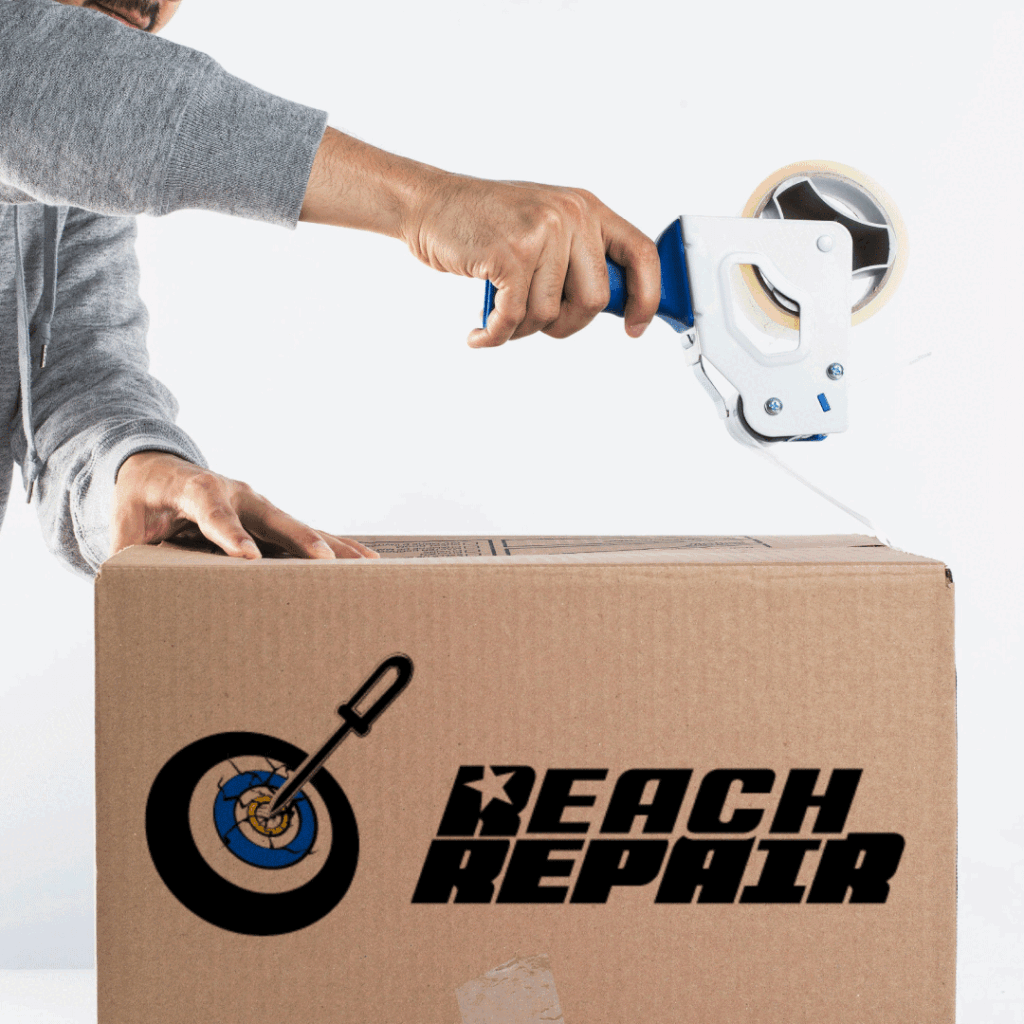
Team Reach Repair was looking for a logo that felt dynamic and full of energy something that could show both their drive and the precision of their work. They wanted a bold, powerful look that really stood out.

I designed their logo to feel like it’s in motion, capturing that sense of energy they were after. I went with a strong, bold font to emphasize confidence, and in the logo mark, I used a screwdriver aiming directly at a board a perfect visual metaphor for their precise, on-point work.