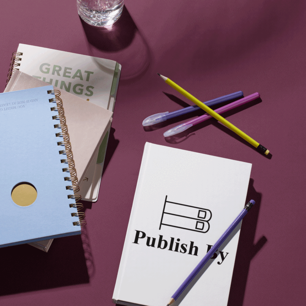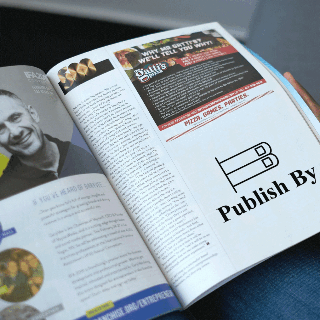
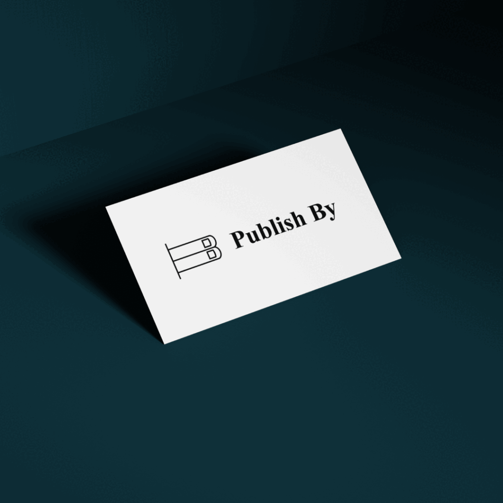
Publish By, a book publishing team, wanted a logo that was neat, clean, and elegant, without any extra clutter. They preferred light, serif fonts to keep the design readable and reflect the simplicity they bring to their products and digital services.

I designed a logo using simple serif fonts for clarity and ease of reading. The logo itself resembles books on a shelf, connecting directly to their work, while cleverly hiding the letters “P” and “B” to represent the brand initials.