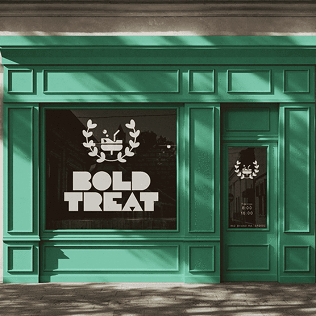
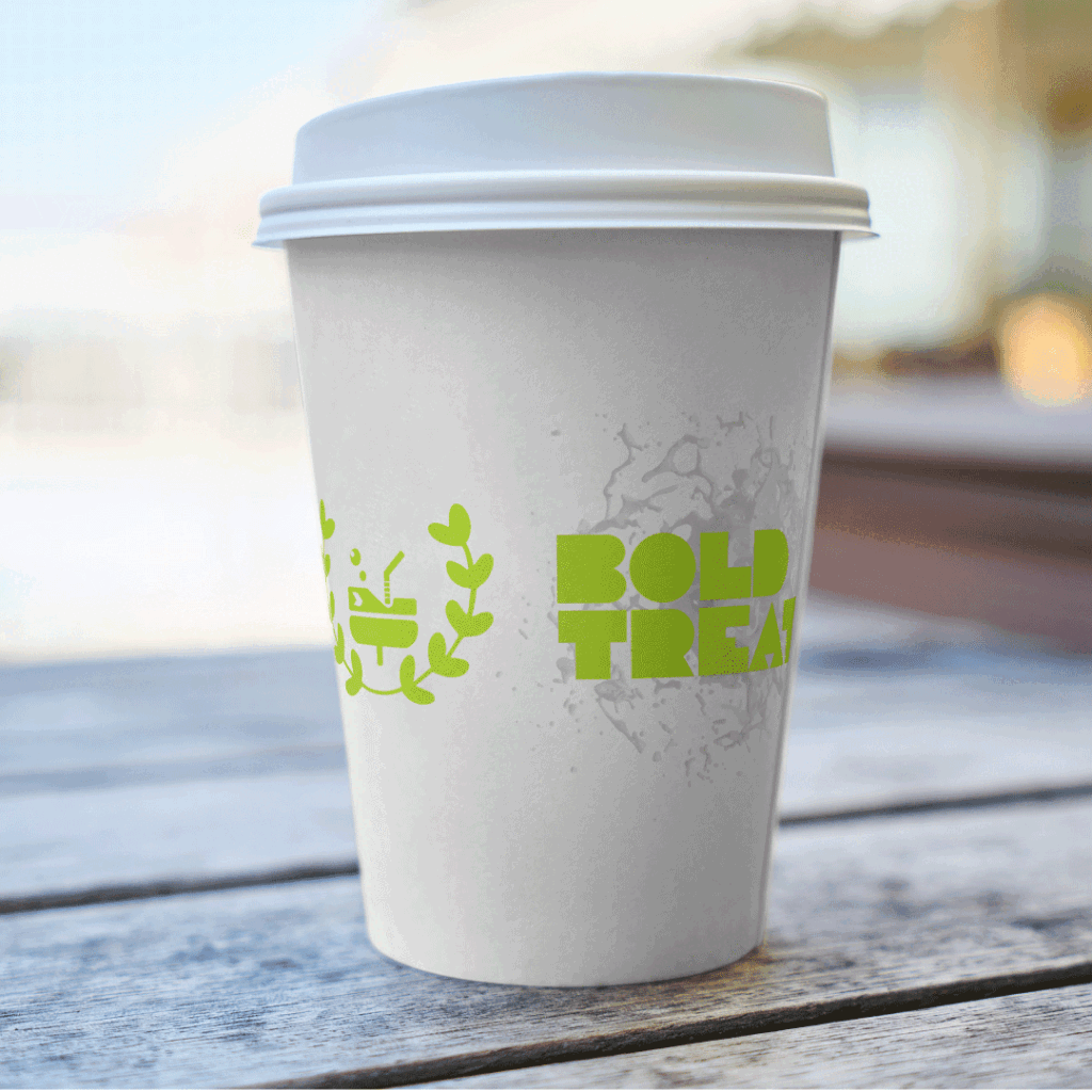
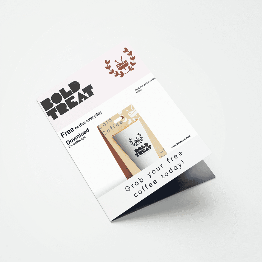
Bold Treat is a premium beverage brand specializing in gluten-free drinks. The brand identity should convey sophistication, elegance, and timeless minimalism, appealing primarily to couples who value high-quality lifestyle experiences.
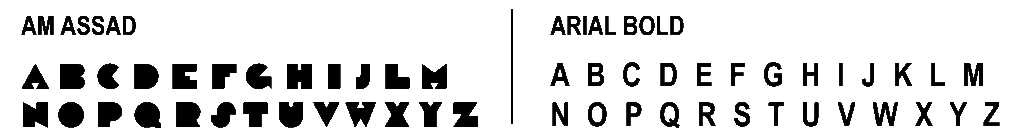
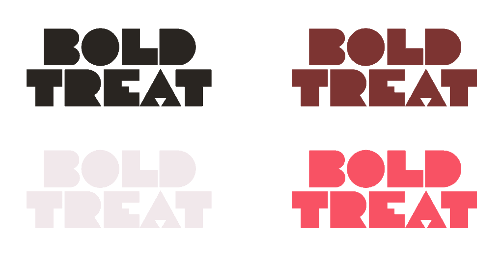
TYPOGRAPHY
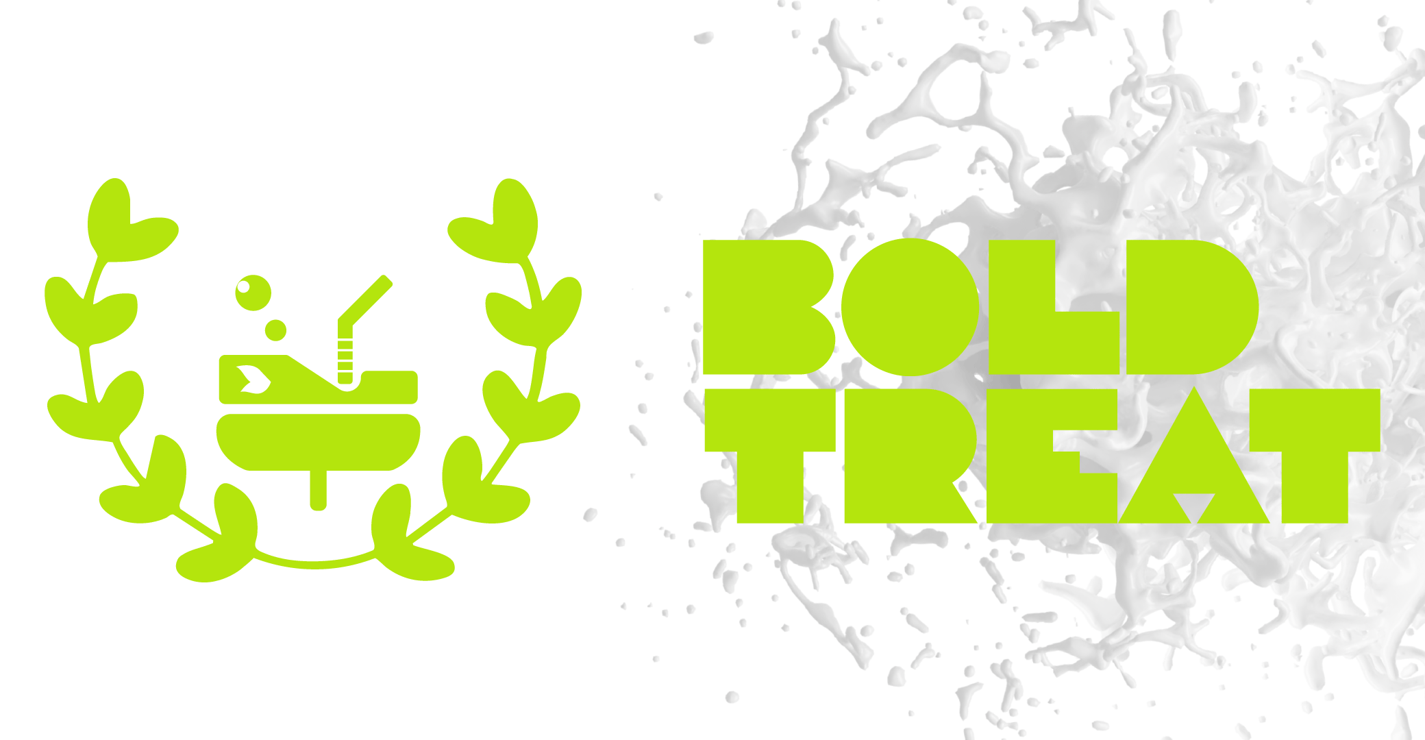
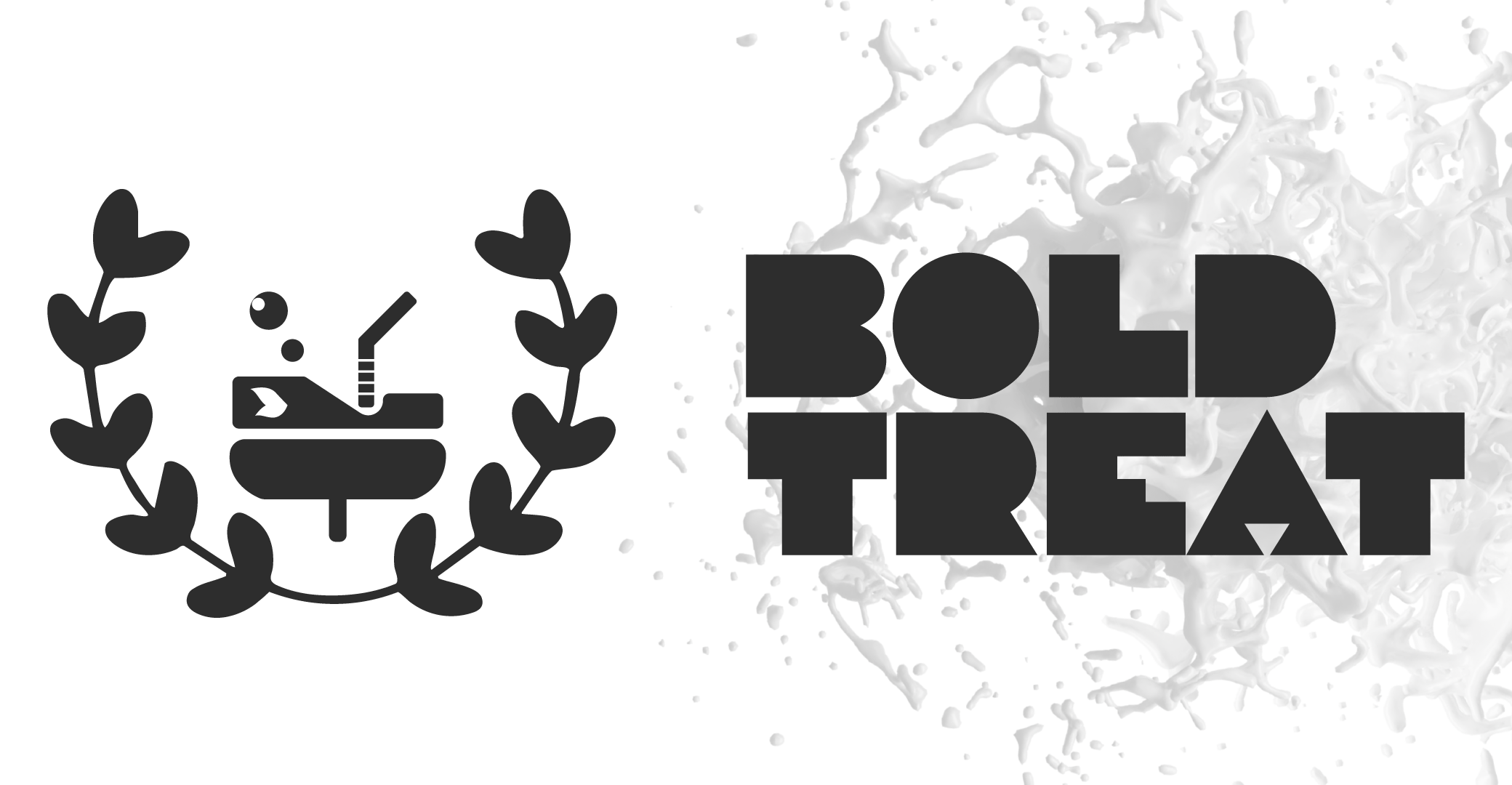
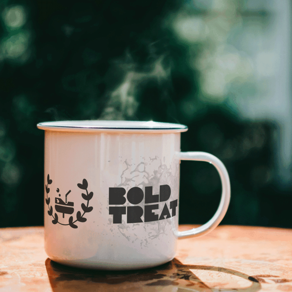
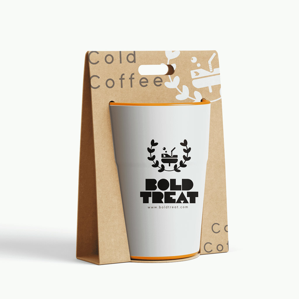
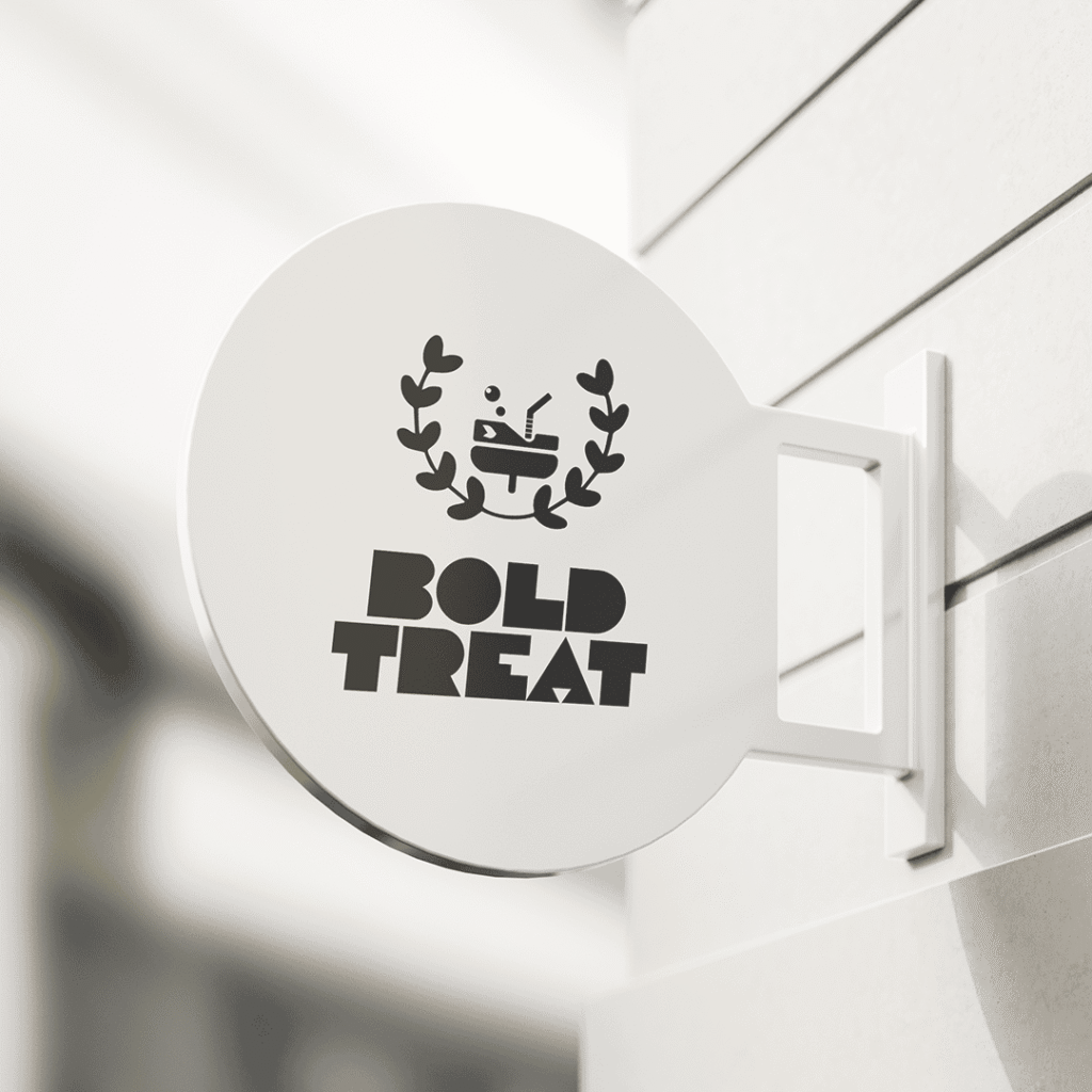
Cup Symbol (Centerpiece)
The overall shape represents a cup, central to the beverage and coffee theme.
The top of the cup lid forms a “B”, symbolizing Bold.
The base of the cup forms a “T”, symbolizing Treat.
Together, it creates a smart, abstract integration of the brand name directly into the logo mark.
Leafy Wreath (Surrounding the Cup)
The leaves are arranged in a wreath like circular embrace.
In luxury branding, wreaths often symbolize victory, prestige, and excellence.
Here, the heart-like leaf shapes soften the design, reflecting love, connection, and togetherness, a meaningful detail since the brand is targeted at couples.
The symmetrical arrangement reinforces balance, elegance, and timelessness, key attributes of a premium brand.